
Designed to Deceive: The Psychology Behind Dark Patterns
An examination of dark patterns in UI design — how interfaces manipulate users and the psychology behind them.
We’ve all been there. You sign up for a “free trial” thinking you’ll cancel later. A week passes, then a month, and suddenly bam! your card gets charged. Why? Because the “cancel” button was buried three layers deep in some obscure settings page. It’s not an accident. It’s design doing exactly what it was meant to do: keep you paying.
These tricks have a name dark UX patterns. They’re those sneaky design choices that nudge, push, or outright trick users into doing something they didn’t intend. From pre-checked boxes that sign you up for newsletters, to “X” buttons on ads that don’t actually close them but open another page dark patterns are everywhere. It’s design with a wink, but not the friendly kind.
Take subscription traps. Some platforms make it incredibly easy to sign up but almost impossible to leave. It’s like joining a gym where the treadmill is right at the entrance, but the exit is hidden behind a locked door and a secret handshake. Then there are hidden opt-outs. Want to decline that add-on? The “No” button is in a light gray font that blends into the background, while the “Yes” button is glowing in neon green.
These choices may boost conversions in the short term, but here’s the catch: they erode trust. And once trust is gone, no clever design trick can bring it back. People might stay because they’re stuck, but they’ll talk and word of mouth is powerful. Just ask anyone who’s ever ranted about an impossible-to-cancel subscription on Twitter.
The ethical debate is real. Should companies prioritize conversions at any cost, or play the long game by building trust? It’s tempting to focus on the short-term win after all, metrics look great when sign-ups spike. But the long-term cost is harder to measure: frustrated customers, bad reviews, and lost loyalty. Trust, once broken, is harder to fix than a buggy UI.
And here’s the thing users are getting smarter. Ten years ago, most people wouldn’t think twice about clicking “Next” without reading the fine print. Today, many are catching on. Dark patterns might still work, but they leave a sour aftertaste. It’s like eating fast food you feel satisfied for a moment, but regret it later.
There’s also a generational shift happening. Younger users, raised on apps and social media, have sharper eyes for design manipulation. They can spot a shady opt-out or misleading button faster than you can say “unsubscribe.” As awareness grows, so does the risk of backlash. Dark patterns aren’t just bad ethics they’re bad business strategy.
Design at its best should empower, not manipulate. A great interface feels invisible it guides users naturally, without tricking them. Think of companies like Apple or Spotify, where design earns loyalty because it makes life easier, not harder. That’s the sweet spot: where usability meets trust.
At the end of the day, the question for designers and businesses isn’t, “Can we get users to click this?” It’s, “Should we?” Because the brands that choose trust over trickery will be the ones people stick with in the long run. After all, conversion might win the battle, but trust wins the war.
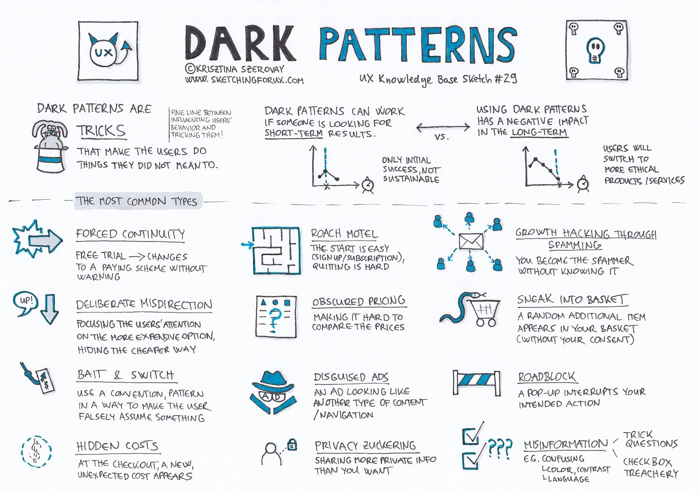
So the next time you’re faced with a design choice, ask yourself: Is this making life better for the user or just harder for them to leave?Ref: https://uxknowledgebase.com/dark-patterns-3b41ed7a690e
Because in the end, good design doesn’t just convert. Good design cares.